Showing posts with label Coloured Pencils. Show all posts

Tuesday, 7 February 2017

First Impressions of Derwent Artists Pencils


So let me set the scene. I'm in TK Maxx with a friend wandering around all the nik naks before we were about to leave. As I was having a casual browse through the clearance section I catch a glimpse of the Derwent logo underneath a couple of books. Hidden on the shelf was a tin of 72 Derwent Artist pencils for... wait for it... £25. Quickly I whip out my phone to price compare incase I was getting excited about nothing. The cheapest price I could find online for these pencils, which originally retail for £115, is £75. And so before I know it I'm clutching at this large tin with a death grip as if I think someones going to fight me for them. I even caused a whole bunch of glassware shelves to the rattle in fear as I walk by with tin.


If you've read any of my blog posts before you might be aware that last year I spent a good amount of time searching for my ideal coloured pencil - click here for blogs on derwent coloursoft and faber-castell polychromos - and in that search I briefly considered buying the derwent artists pencils but eventually settled on faber-castell polychromos which I absolutely love and highly recommend to anyone looking for a good quality coloured pencil that aren't so expensive you have to sell an organ. Even though I hadn't bought the derwent artists pencils back then I was always curious about them since I knew they where wax based (unlike the oil based polychromos) and are considered a harder leaded pencil meaning they are easier to sharpen to a point making detail work a charm.

Now that I have tried them out the first thing I will say is that I am so glad that I got
them at the price that I did because if I had invested full price for them I would be quite disappointed with their pigmentation quality. Not that they are bad pencils, they just don't have the colour pay off I would expect for the price you pay for them. Even though I knew they where hard, which is great for layering, the colours seem almost diluted and you have to work quite a bit harder to get anything nearer the vibrancy of what the colours on the end of the pencils claim to be.


Before I tried them out with an actual drawing I went through all the pencils and
sampled them to see if they where the same quality across the set. While doing this I found that a couple of colours where more colour true than others and even some felt like they had a slightly different texture. You'll notice a blue square that pops more than the others and when using that one the lead felt slightly softer which I prefered since I didn't have to lean as hard. Overall the darker colours where easier to use over the paler colours such as the yellows.

Even though I knew they where hard leaded pencils I still expected to be able to eventually build up the colour but before I even got to the colour I expected the wax starts to build up making it hard to add more layers leaving you with a slightly faded colour that can go no further- you'll be able to see this with my bug drawing. I will say though that I tested these pencils at first on paper with little to no tooth (the WHSMITH basic sketch pads) which could have some part to play with this issue. When I eventually tried the pencils on paper with more tooth the colours seemed to pop a little more and I noticed it was very important to keep the pencil sharp in order to layer the colours correctly.  

If you look closely you will see the pencil has taken on an unusually hairy sort of texture.
I will continue to use these pencils mainly because they are so easy to use for detailed, light work, but what I think people need to know about them is they have limitations to what they can do. If you're going for a subtle look they are ideal but if you want to pack a punch with colour you're going to spend a long time trying build up colours that might not get to where you want them in the end. Something to keep in mind. Also, as touched on before, they need to be kept sharp and used on paper with some texture in order to perform at their best. The more smooth the paper, the more likely the pencil will burnish quicker making it harder to build up layers a depth.

I think if I can begin to use them alongside my polychromos I could get some good work but I've yet to try and see if the wax and oil will mix well. I get the feeling that I might be using them in the wrong way because some people seem to love them. If you have any tips I'm all ears! Show me your ways. If my opinion changes over time I will be sure to let you know. At least I can say I have tried them now and for the price that I got them for, who can say no. All I have left to try is prismacolour, derwent inktense and drawing pencils. Let's be real though, Caran D'Ache Luminance are the ultimate dream.

Hazel, xoxo

Thursday, 1 September 2016

August Sketch A Day Faves

Off the bat I will say this month has dragged a little. Every other month this year I blinked and it was done whereas I've been convincing myself for half this month it was already September. It's not that I've been bored, I've spent most of month working and watching the Olympics (I've said it before and I'll say it again, Rhythmic gymnastics....WOW!), so it makes little sense as to why August has seemed to last so long. 

I've continued to pace out my work and have been enjoying it even though I have significantly less work to show for the month. And with that being said let's show and tell my collection of favourites.


At the start of the month I finished my AJ Michalka portrait. It seemed only right to draw the AJ to my Aly from July. I used the promarker and pencil technique from before and really enjoy how it looks in the end, especially with a bold solid colour in the background. The challenge with this one was definitely the hands which when I look back are quite similar to the hands from the Emily Blunt Huntsman portrait I did a couple months ago. I must be drawn to that particular pose. AJ was kind enough to repost the piece to her Instagram page which is always a thrill.


I finally got some black Pitt pens to try and this was my first go using them. I think they have a lovely finish and I intend to continue using them possibly for illustration work. With the dancer piece I tried to create some movement and hopefully in time I'll get the hang of that. My style is quite tight but to create movement it needs to be more loose. Not my strong point but it's a goal. And I really love my owls little face!


This acrylic painting was done specially for my Mum. She has been asking for a painting of mine and my siblings childhood teddy bears for quite a while and this was the month I finally granted her requested. Since my room is quite small it is hard to do acrylic pieces just because I don't have the best set up. Thanks to my brother I have a portable tabletop box easel which I can set up on the bed but if I'm painting for too long my back tends to hurt since I have no back support. Luckily this one didn't take up too much time and the teddies seemed to flow out of me (apart from that creepy teddy on the right). Painting this piece reminds me of just how much I love acrylics. Definitely need to think up more ideas for other canvases.


I've been seeing a lot of awesome work done with pastels online recently so thought it was time to give them a go again. As I have probably said before I find pastels a little too messy for my liking so to try and combat that I bought both pastel sticks and pencils for more precise detail. The colours are so pretty and they blend lovely. Once I have used them more I hope to do a blog post about them and how I have gotten to grips with them - if I ever do. 


This is the month of Britney Spears' Glory. If you haven't listened to the album and you enjoy pop music I highly recommend you give it a whirl. It's basically a mix of elements from In the zone, Britney and a hint of Blackout. The day I listened to the album was the day I drew this. I just got my grey Strathmore sketch pad which is such a great size. I didn't expect it to be as big as it was. Plus I was finding it hard to find a pad of just grey paper here in the UK. This pad was an import from the US on Amazon. I can't wait to see how colour pencils will work on it. So many possibilities! 


I have finally started using PayPal and taking commissions. It has been a some time coming. I had been thinking about it for a while but didn't quite know if there was a demand for it but when I did my Aly drawing last month and people seemed to be interested I thought it was time to get things rolling. This piece is for a former work colleague of mine and she has been great through the whole process. She has been like a cheerleader for me and I can't thank her enough! The next step will be to set up some sort of store, whether it be through Etsy or elsewhere, and sell prints and so on. But for now I'm just focused on the commissions and putting together a solid price list. This is another topic I wish to do a blog post on so stay tuned next month.


My last two drawing of the month make my favourites purely because I think they show some improvement compared to some of my other work in pastels and charcoal. All I need now is a better fixative, other than hairspray, to hold them in place so I'm open to suggestions. Also I really like the expression on the portrait piece. I'm a sucker for emotive faces.

My goals for next month are to do smaller pieces just so I can work on my speed. I can be quite slow sometimes. And other than that I just want to continue using pastels and other mediums to improve my skills. Drawing aside next month I will become an aunt for the second time so I'm quite excited for that!

Roll on September!

Hazel, xoxo


Sunday, 31 July 2016

July Sketch A Day Faves

This month I fully embraced spreading sketches out over a few days instead of pressuring myself to churn a new one out per day. In the months before I could feel stress building up over trying to produce a different sketch everyday and I think it was the main reason why I've increasingly been missing days.

With that in mind there are less favourites this month but only because more time was put into them. The main materials I used in July were promarkers and graphite pencil with coloured pencil thrown in ocassionally. Here are the best from July!


I had avoided doing eye drawings partly because if I let myself I would do them all the time but mainly because Instagram is full of them and they have begun to feel slightly cliché (if that's the right word). But with Lindsay Lohan's birthday passing (an old fave) I couldn't risk drawing her beautiful eyes. I think it's the eyelashes and grey combination that I love.


Done over the course of many days, this was the follow up piece to my diner marker drawing which I love mainly for the birdseye view. At the risk of sounding creepy I like the feeling of being a fly on the wall witnessing candid day to day moments and even though there are no faces you can get a feeling of mood from the setting and colours. The drawing feels comfortable and homey to me, probably because of the clutter and home baking.


Legally Blonde turned 15 and I wanted to commemorate it by drawing from my favourite scene in the movie. The original plan was to do five expressions but in the end I just stuck with these three and really love the finished sketches! With each one I managed to a get a little quicker so who knows how fast I could have been by the fifth face. Another time maybe. This drawing led onto my Princess Diaries drawing later in the month. I definitely want to continue doing facial expression work. 


I went on a spree of drawing colourful insects when I was stressed about producing larger scaled detailed work but these studies managed to calm me down with there simple shapes and fun use of colour. Plus I got to use my white gel pen for highlights which is one of favourite things to do. 


Fun fact - I've never seen the entirety of the Wizard of Oz, only clips here and there, so there is really no good reason why this drawing came to be but I love it all the same. I was thinking about all the old Hollywood actresses I loved and drew in June and after watching a documentary run down of the best hollywood musicals it got me thinking about Judy Garland and how I knew of her but yet hadn't seen any of her work. I so I found an image of these ruby slippers and decided to draw them. I really like how the reflection on the floor turned out along with the green background. 


I went full out on this one! I saw that you could do a layering technique of promarkers then coloured pencils and wanted to try it out and so chose Aly Michalka as my subject. Since I was able to put down base colours with promarkers, almost like an underpainting, it allowed me to be quicker with the coloured pencils which I can find annoying if I spend too much time with them, especially on hair. Pretty sure it's the first full portrait I have finished this year and I'd say it is one of my best ones technically all year. Helps that Aly is stunning as well. I've managed to incorporate markers, pencils and facial expression all in the one. Proud of this one. 

Finally got to see Finding Dory and I loved it some much. So glad Pixar are back on top form again! Baby Dory is the cutest thing ever so I had to draw her! A fun promarker drawing, especially with blending all the blues.


And my final favourite is a drawing of an old family photograph of me and my cousin that my dad had pestered me to do. I hadn't actually see the photograph before which is always nice. When I finally got round to drawing it I remembered how much I love drawing familiar faces. I might actually try and dig up more photographs and draw them. I'm bias but I think my childhood photos are the best. But doesn't everyone think that of there own.  

My goals for next month are to possibly start a series of illustrations for my nephew and his new brother that will be arriving in September, pretty close to his own birthday. But we shall see. On top of that I have been inching to decorate my room with a wall mural so I want to design something pretty, possibly floral. I also maybe wanted to try and get to grips with charcoal or pastel. That's a big maybe though. Not sure if a messy person and a messy medium should work together. I also keep forgetting that I have canvas boards to use so I need to start coming up with ideas. Notice how these posts are mostly reminders for myself. Anyway...

August... here we go!

Hazel, xoxo


Tuesday, 5 April 2016

Faber-Castell Polychromo Pencils - My Goldilocks pencils


Dare I say it but I think I may have found my ideal coloured pencil. I previously posted about being on the look out for pencils that where not too pricey but yet where of a good quality. And to be honest I think that it near impossible to find. You have to invest some money if you want quality. I was so close to buying Prismacolor because of its price but after reading more reviews about the constant breakage of the lead I knew it just wasn't the pencil for me.

And so this was when I stumbled upon Faber-Castell Polychromo pencils. Unlike most pencils they are oil based meaning they are great at blending but also can be layered up without the patchy and waxy consistency of pencils like coloursoft or prismacolour. The lead can be sharpened to quite a fine point which is great for detailed work and the pencil itself isn't too soft but yet you don't have to lean extra hard to get strong colour like you would for most coloured Derwent pencils.


I think Faber-Castell Polychromos may be the goldilocks pencils I was on the search for. I ended up getting a set of 36 to get a wide array of colours. Also what is great about these pencils is you can go online and buy colours separately to add to your collection unlike other brands. The tin I have doesn't contain any solid skin tones but if I want I can order them online. For now I'm just going to play about with their blending capabilities to see if I can get similar colours but it's great to have the option. Plus I think mixing colours creates more dimension instead of flat, solid skin tones.

All in all I'm a happy bunny. I will say they weren't the cheapest of the bunch which is why I opted for a medium size set otherwise I would have got the whole collection. They cost around £40 for 36 but I can justify cost since they are so good. If your anything like me when it comes to coloured pencils I would recommend buying them. Obviously everyone's preferences are different. I personally just don't like having to lean really hard to get the colour pay off I want but also want the option of layering up the colours. With these pencils it's quite easy to do.

I hear good things about other brands so maybe in the future I will try them out but for now I'm happy!

Hazel, xoxo

Thursday, 24 March 2016

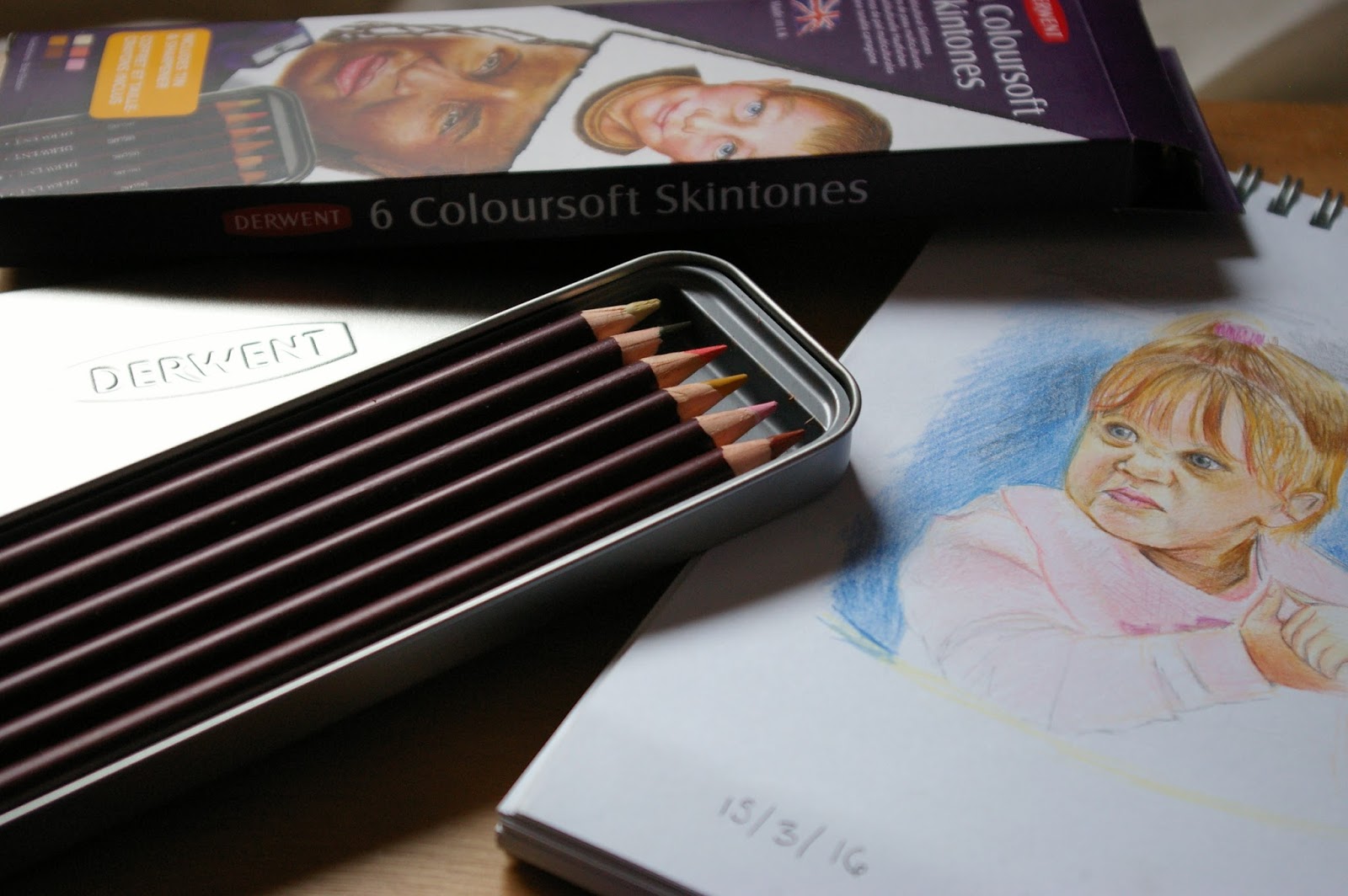
Shopping about for Coloured Pencils - Derwent Coloursoft Impressions


Recently I have been on the search for my ideal coloured pencils. Currently I'm using an old WHSmith brand and a bunch of random pencils I have gotten over the years so I thought it was about time I invested in some good quality pencils.

My first thought was to buy Prismacolour since most people online agree that they have great colour pay off while not being as expensive as other brands. Unfortunately the only place they are available is on Amazon and if I was to buy them as a complete set they would put me back around £60-£70. So as you can imagine I have been looking up more reviews to see if they are actually worth the money. Even though they are great for colouring many people have said that they can break quite easily and to be honest I don't want to buy a brand I haven't tested myself.

My next option was to buy some Derwent pencils. I currently use the graphic pencils and I'm very happy with them. Derwent do many ranges but I narrowed it down to the Artist pencils and the Coloursoft ones. I came across a small tin of coloursoft skintone pencils on Cass Art's website so went ahead and bought them to test out before I took the plunge and bought a bigger set.

My initial impression of them was how waxy they seemed which makes them good for blending, as long as you don't keep layering up the colours. I did enjoy how easy it was to apply colour to the paper and the pigment was pretty good. However the texture of the colour wasn't always ideal and I was only able to get the colours I wanted if I mixed them with my WHSmith pencils. So currently I have decided not buy a big set of the coloursoft pencils for now.


The colour pay off is good and the blending is okay as long as you don't keep layering up the colours. It can turn quite waxy and patchy in parts. Also works well with other pencils.

So I have looked into the Artist Pencils but unfortunately the majority of people who have used them say that you have to lean quite hard with them to achieve vibrant colours. However the pencils will last a long time unlike Prismacolour's easily broken led and the colours are buildable.  

So I'm back to square one. Ideally the pencils I'm looking for have good colour pay off without leaning too hard and I can layer up the colours without fear of it looking strange like the Coloursoft eventually does. If only Derwent did a range inbetween the Coloursoft and Artist pencils where they are both blendable but not too soft - a Goldilocks range. But it seems that the only other ranges they do are Inktense and pastel pencils which are not what I'm currently looking for.  

My WHSmith pencils are okay for now. And really if I was able to find a bigger set of them I would be tempted to buy them. But chances are they don't make them like they used to. If anyone has suggestions let me know. I'm still looking.

Hazel, xoxo